

A logo is the shorthand for everything behind it: the history, the craft, the feeling of a place or product. It is a quiet mark which carries a lot of weight. It's often the very first handshake between a brand and the world. The mark which says who you are and what you stand for, before a single word is read. It's not just a decoration, it's a promise, repeated every time someone sees it.
Over the past few months, we introduced our refreshed logo as a contemporary expression of our brand. An elegant evolution of Warwick's most recognised symbol. The redesigned mark honours the spirit of the original while remaining deeply rooted in our heritage as a meaningful icon.
We didn't want a new symbol. We wanted this one to breathe a little more freely, to carry the same century-old promise of love and good fortune, in a form that feels as current as the brand is today.
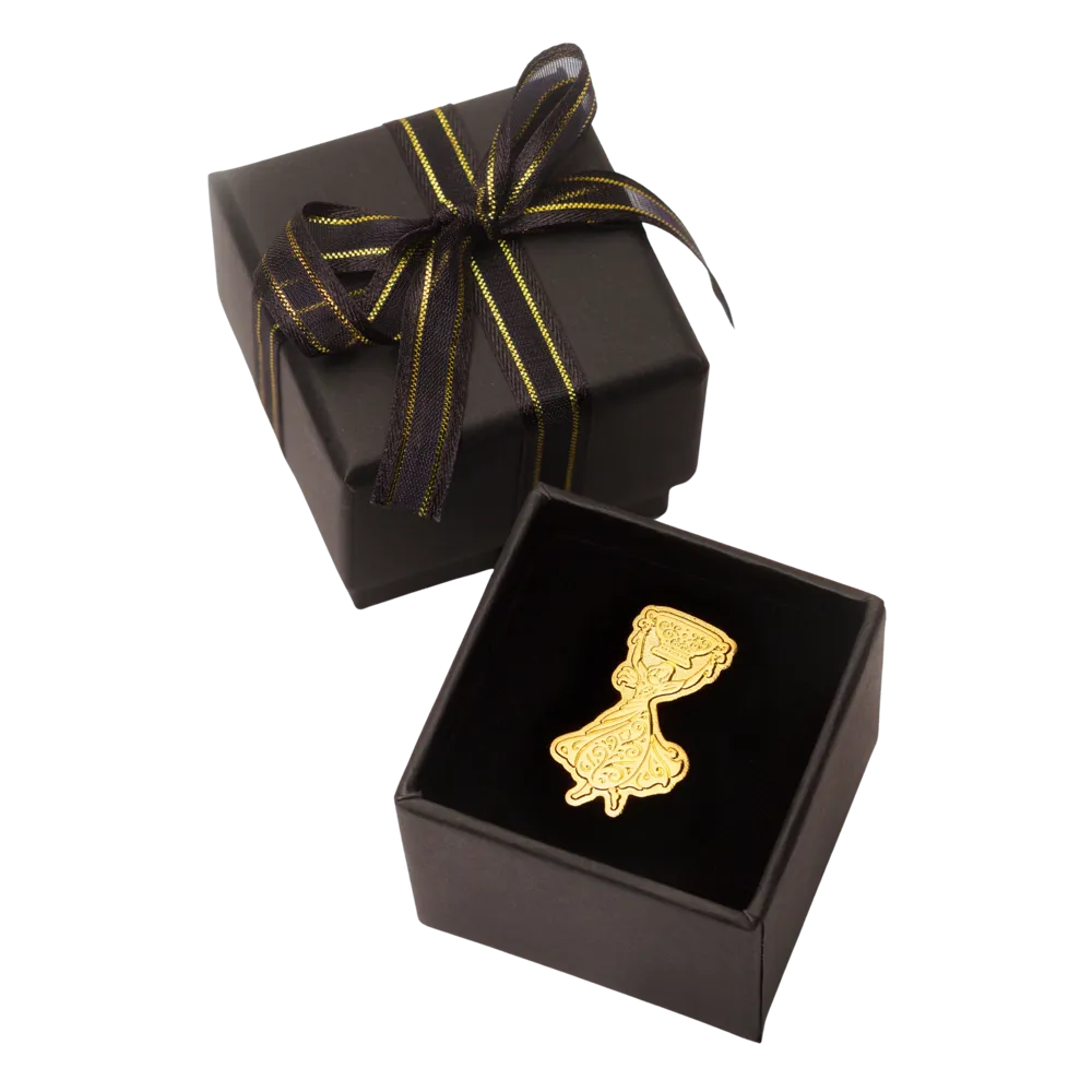
The graceful figure, with untied flowing hair and a swirling skirt exuding joyful motion, still raising the same cup, still telling the same story, just a little more freely than before.
Carry the Story With You
A lapel pin is a quiet symbol. Worn by those who know its meaning, noticed by those who want to. We've cast our refreshed logo as a clutch lapel pin, to carry our wedding cup story with you.
Brass stamped with a sandblasted background, boxed and wrapped, our lapel pin is 30 x 16.95mm, priced at R375 inclusive of the box, is now available to purchase on our website.